The Idea: Study Paper Money, Build a Digital Brand
Most rebrands follow the same playbook: hand it to the brand team (or an agency) and ask for 'cleaner' and 'more modern.' Plaid did something smarter. They looked at paper money."
Their brief? Keep the nostalgia of money, make it clean and modern. They nailed it.
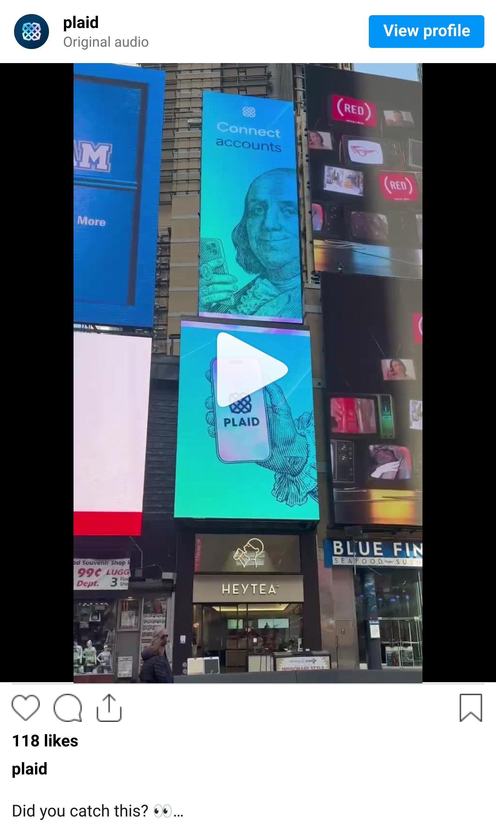
Their design team studied the guilloche patterns on bills (those intricate engravings from the 1800s meant to stop counterfeiters), the holographic security strips, the woodcut portraits. Then they asked: what if we brought all that artistry and trust into our digital brand?
The result? Guilloche patterns became data visualizations. Holographic strips became their color palette. It's not just pretty—it's meaningful. Every design element says: we connect the financial systems built over centuries with the frictionless digital experiences you expect today.
Why Most B2B Brands Are Boring (And Plaid Isn't)
Corporate blue gradients. Stock photos of meetings. Copy written by lawyers.
Plaid rejected all of it. Their brand is bold—vivid colors, dynamic patterns, actual energy. And here's the genius: they made complexity simple. "The world of finance is dense and convoluted," they write. "As with our products, we aim to make it simple."
This is the paradox they solved: how do you make an invisible infrastructure company visible and memorable?
And we are excited for the trend of B2B companies leaning into the importance of a brand, voice, visual consistency, and beautiful design…at every touchpoint.


The Story They Tell
Great brands tell stories. Plaid's is rooted in a truth we all know: we take frictionless experiences for granted.
You tap your card. The payment works. You link your bank to an app. It connects instantly. Behind that magic? Plaid. The invisible foundation.
Their brand makes that invisibility visible—but in a way that's delightful, not technical. CEO Zachary Perret put it perfectly: "Behind every seamless and ordinary activity, there is usually a very powerful infrastructure in place."
That's what Plaid owns.
Three Things to Loan
1. Find a real metaphor
Plaid didn't just pick colors. Paper currency became their conceptual anchor—security, artistry, trust, heritage. What real-world thing embodies what you do?
2. Make complicated things simple
Plaid works in infrastructure. They could hide behind jargon. Instead, their copy is clear, conversational, human. Complex products don't need complex marketing.
3. Let personality show
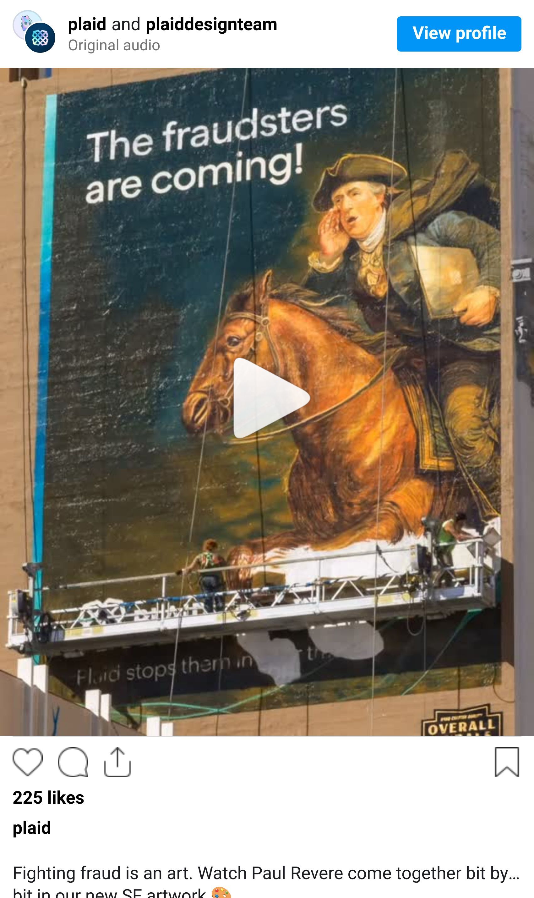
B2B doesn't mean boring. Plaid's woodcut illustrations have "playful twists." Their photography is light-filled and vibrant. They stand out because they refuse to blend in.
Why It Works
This isn't just aesthetics. Plaid grew from serving fintechs to landing 1,000+ enterprise customers—H&R Block, Western Union, Zillow, Carvana. Their products expanded from account linking to identity, payments, lending, fraud prevention.
That growth needed a brand that could carry the weight. The new identity says: we're not a point solution. We're a platform. We're the plaid that weaves it all together.
The Lesson
Most rebrands try to look "modern" or "professional." Plaid rebranded to look more like themselves—just clarified and amplified.
They understood the challenge: infrastructure companies succeed when they're invisible, but you can't build a business if no one knows you exist. The solution isn't to scream louder. It's to make your invisible work feel essential, trustworthy, beautiful.
That's what Plaid did. And that's why it works.
Another example of the importance of a strong brand. We aren't buying something if we don't know what the brand is. 🙂


Yes! We love Tony’s Chocolonely…feel free to send us some. 🙂
Have another brand you'd like us to analyze, hit reply and let us know. And don't forget to share this with your friends, or just subscribe for them. 😉 😜
